Image Cards
Image cards are a great way to display information about research areas, labs, or different tracks of study.
Image Card Fields
Note on editing your image cards:
Unlike events and articles, you will need to edit your image cards through the 'find content' option in your admin bar. Once you pull up your list of image cards, you can click on the 'edit' link in the Operations column.

Title:
This is the title of the image card. It will determine the URL (unless you manually change the URL path setting) and will display in the 'find content' list.
Thumbnail:
The thumbnail upload photo will appear on the image card after it is opened and also on the image card landing page.
Description:
The description is a WYSIWG area that is below the title. You can add text, images, and video.
People Teaser:
This section allows you to choose from the person profiles on your site and pull them into the page as a teaser. Layout options include 1, 2, or 3-columns with either white or grey backgrounds. You may either select individual people or choose a taxonomy term to pull in all people with that tag. Be careful though- if you select people manually and select a taxonomy term then nothing will display. You must choose one method or the other but not both.
Link Text and Link URL:
The link and link text display in a blue rectangle directly below the thumbnail image.
Callout with Subtitle:
This section consists of title, subtitle, and description fields for text only. It displays below the description area.
Optional Callout:
This section has a title field and a WYSIWYG area where you can add text, images, and video.
Related Links:
The related links section is an area where you can add a list of links. The 'see also' title above this section is uneditable.
Testimonial:
The testimonial section lets you choose from a list of existing testimonials in your website. It is a separate content type that can be pulled into the page. If you need to add a new testimonial that isn't in the dropdown list, you will need to add it to your site first.
Image Card Terms:
This is a list of all of the available taxonomy terms for Image Cards. Tagging your Image Cards with taxonomy terms allows them to be sorted by categories on your Image Cards landing page.
Search:
Adding a word to this field will affect the internal site search results. If a word is entered into that field, regardless of whether it is in the content of that page, the internal site search will place a higher weight on that page when someone searches for that word.
Image Card Examples
Need some inspiration? Here are a few examples of image card layouts and what sections are being used in each one.
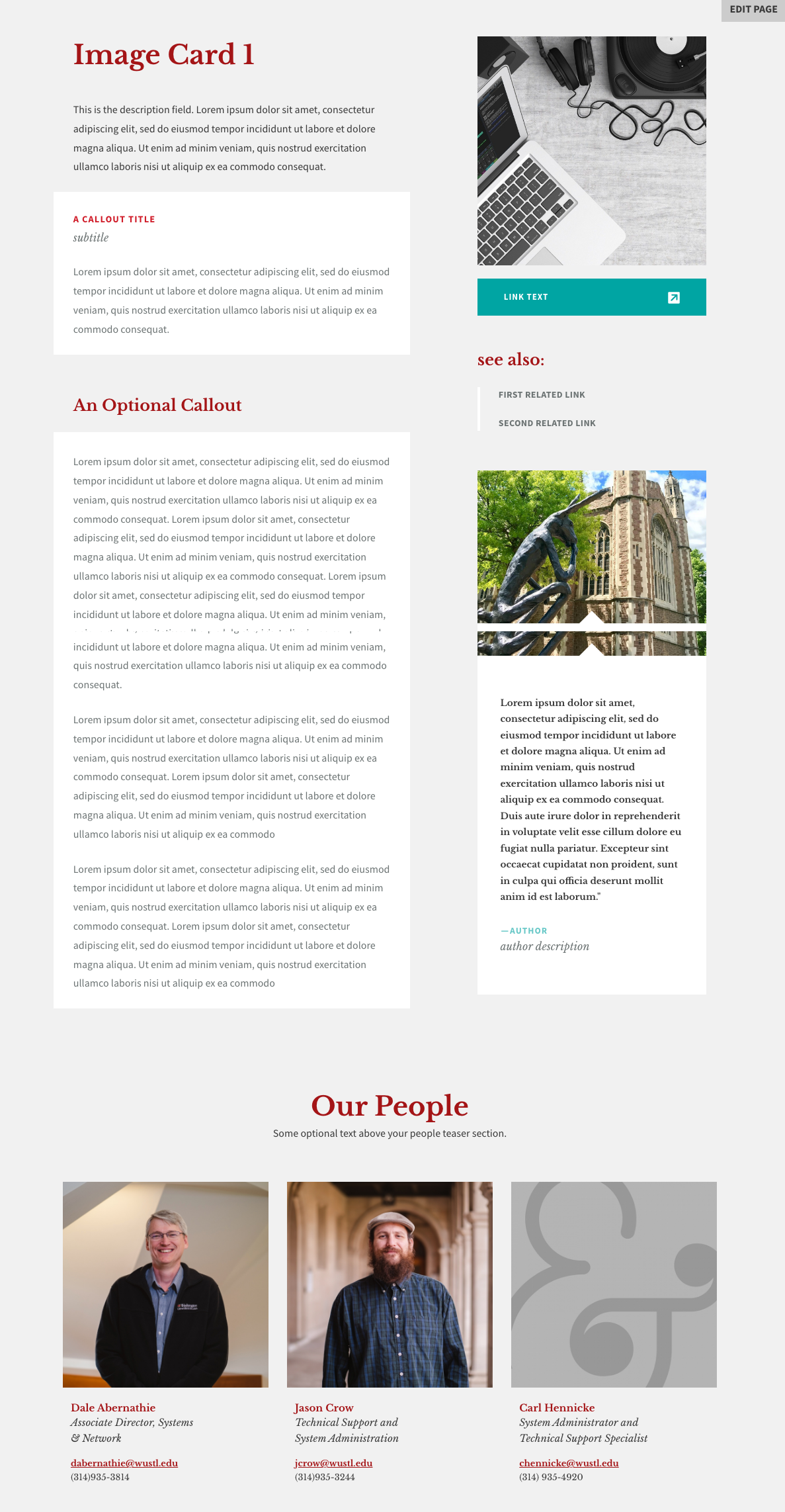
Example #1
This example shows an image card using all available fields.
Example #2
This example shows a simpler image card using only the title field, thumbnail image, description, and a related link.
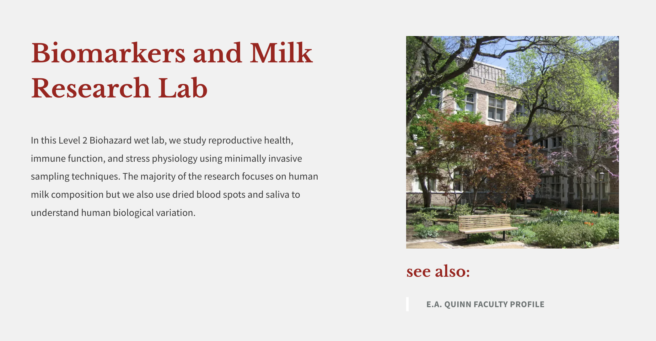
Image Card Landing Page
This page will display all of the published Image Cards in your site along with other sections to help organize your content.
Landing Page Sections
Title:
This is the title of the image card. It will display in the 'find content' list.
Header:
The Header section has a static background image upload, a headline field, and a description field. If you upload a background photo, you will have a choice of a red, dark, or white image overlay. If you do not upload a photo, you can choose to have a solid red, dark, or white header background. There is also an option to display an ampersand icon in your header.

Callout:
The callout section is a WYSIWYG area that will allow you to display text, images, and video.

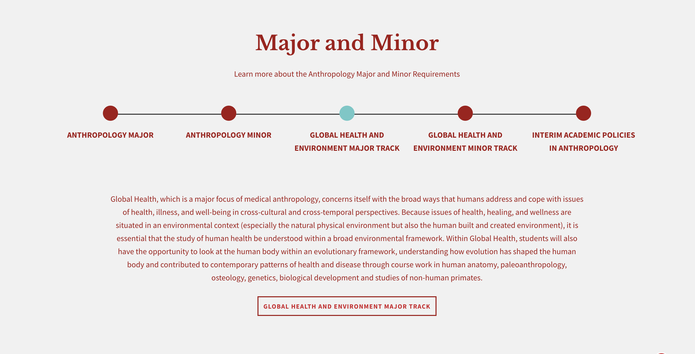
Dotted Line:
This section is helpful for illustrating areas such as program subsections or department majors and minors. At the top, there are fields for a title and subtitle. You can also add up to five dots and can choose between a red, grey, or white background color. As the user clicks on the dots, they see a brief overview of your program. They can click on an optional link to get more information.
Resources Callout:
This section allows you to display selected resource cards that already exist on your site. They can be reordered by clicking on the arrows next to the cards and dragging and dropping them into the desired order. Each resource card has a title, subtitle, icon, and link to a page or document with more information. All resource cards in this area will also be displayed on the Resource Landing page. You can also add links to the red Additional Resources area below the resource cards.

Testimonial:
The testimonial section lets you choose from a list of existing testimonials in your website. It is a separate content type that can be pulled into the page. If you need to add a new testimonial that isn't in the dropdown list, you will need to add it to your site first.

Footer Callout:
The footer section is at the very bottom of the landing page and displays text and a button. You can also add social media links, an ampersand icon, and have a white or grey background.

Layout Options
The Image Card landing page can be set to display as a list (text) or as cards (images). Unlike the Events and News landing pages, the layout can be switched by the user by toggling back and forth between the list or card icons below the search bar. The card view is ordered by the "authored on" date of each card. The list view is ordered alphabetically.
Card Layout:

List Layout:

Taxonomy/Filter Terms
The taxonomy terms on your Image Card landing page are located under the search bar and are used to sort your image cards by category. You can tag a piece of content with multiple taxonomy terms. If you do not tag a piece of content, the content will still display on the landing page, but will not display if a user clicks on taxonomy terms since it hasn't been tagged with anything.
You have three options for displaying your taxonomy terms:
ALWAYS OPEN:
The taxonomy terms will always be visible.

COLLAPSED:
The taxonomy terms will be hidden and the user can click on the 'V' to make them visible.

HIDDEN:
There will be no taxonomy terms visible to the site visitor, only the search bar. However, they will still be available when you are editing the image card and would like to tag it with a taxonomy term.
The 'all' taxonomy term will always display in the list of categories and cannot be removed. Any changes that need to be made to the article taxonomy/filter terms or how they display can be sent to the web team at artsci-webteam@wustl.edu
Reordering Image Cards
Ordering by Date
- Edit an image card and locate the vertical tab section to the right.
- Select the tab named Authoring information
- Edit the "authored on" date. Earlier dates are first, later dates display lower on the page. This date does not display to site visitors.
- Save

Note: The list view of the Image Card landing page will always be ordered alphabetically. The order cannot be changed.