Resource Cards
Resource cards are a way to create organized, browsable links to other content in both your site or in another website. A Resource can display on the Resources Landing Page, a Multipurpose page, and/or an Image Card landing page with a graphic icon representing the information available.
Resource Card Fields
Note on editing your resource cards:
Unlike events and articles, you will need to edit your resource cards through the 'find content' option in your admin bar. Once you pull up your list of resource cards, you can click on the 'edit' link in the Operations column.
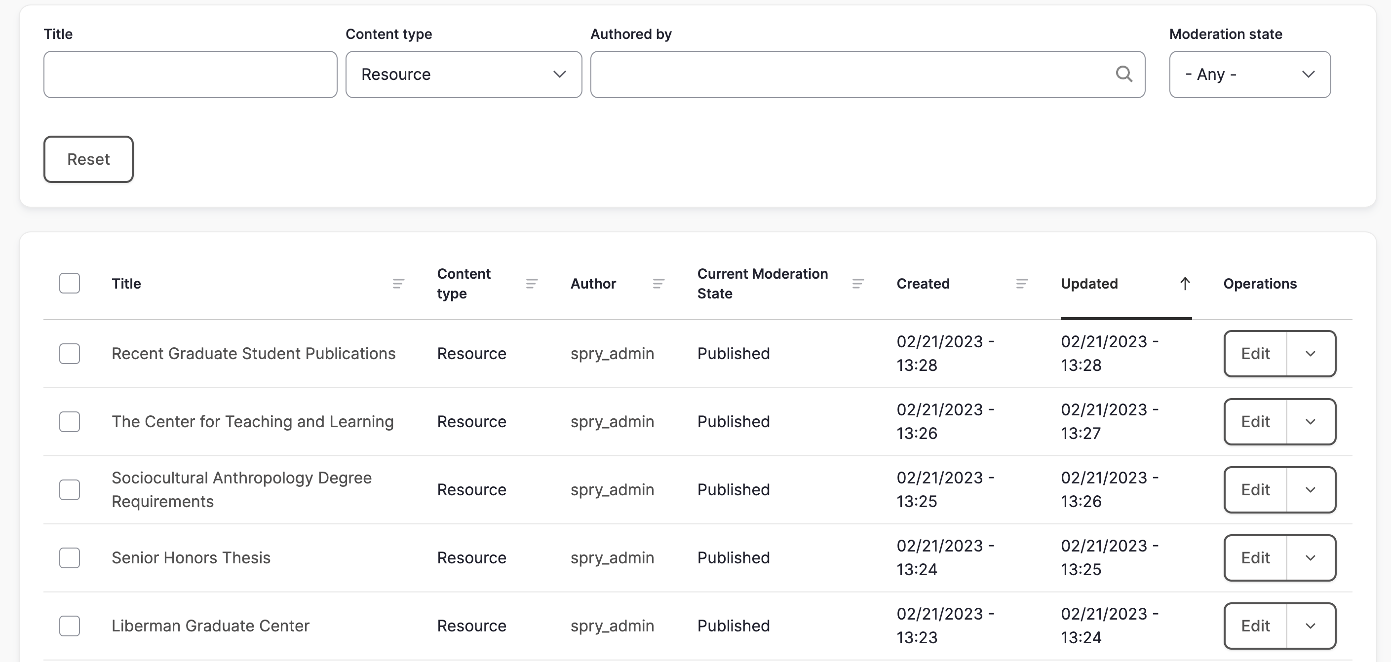
Title:
This is the title of the resource card. It will determine the URL (unless you manually change the URL path setting) and will display in the 'find content' list.
Icon:
The image upload section allows you to choose an icon from the 'icon' folder in your media gallery. All sites have access to the same icons.
Title:
This second title field is the title text that shows up on your resource card.
Subtitle:
The subtitle field is for a short description about what the user can expect to find when clicking on this resource card. If possible, they should start with a verb, be all lowercase, and have no ending punctuation.
Resource URL:
Enter the URL of the page or site you want your resource card to link to.
Category:
This is a list of all of the available taxonomy terms for Resource Cards. Tagging your Resource Cards with taxonomy terms allows them to be sorted by categories on your Resource Card landing page.

Resource Cards Landing Page
The Resource cards landing page is a list of all of the published resource cards in your website.
Landing Page Sections
Title:
This is the title of the article. It will determine the URL (unless you manually change the URL path setting) and will display in the 'find content' list.
Introduction:
The Introduction section has a static background image upload, a headline field, and a description field. If you upload a background photo, you will have a choice of a red, dark, or white image overlay. If you do not upload a photo, you can choose to have a solid red, dark, or white header background. There is also an option to display an ampersand icon in your header.

Jump-To:
The jump-to section lets you add links to other department or university resources that your users might find helpful.

Testimonial:
The testimonial section lets you choose from a list of existing testimonials in your website. If you need to add a new testimonial, you will need to add it to your site first.
Footer Callout:
The footer section is at the very bottom of the landing page and displays text and a button. You can also add social media links, an ampersand icon, and have a white or grey background.

Layout Options
The Resource landing page can be set to display as a list (text) or as cards (images). Unlike the Events and News landing pages, the layout can be switched by the user by toggling back and forth between the list or card icons below the search bar.
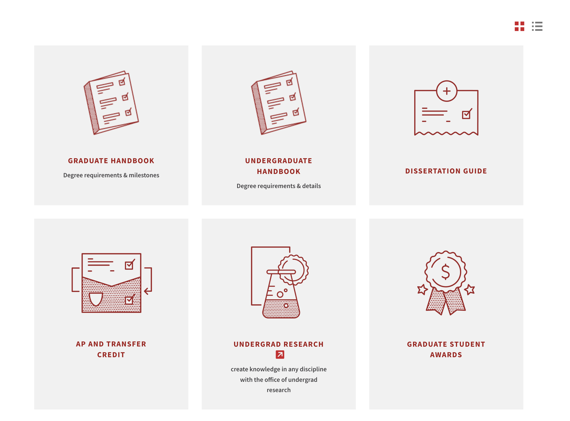
Card Layout:
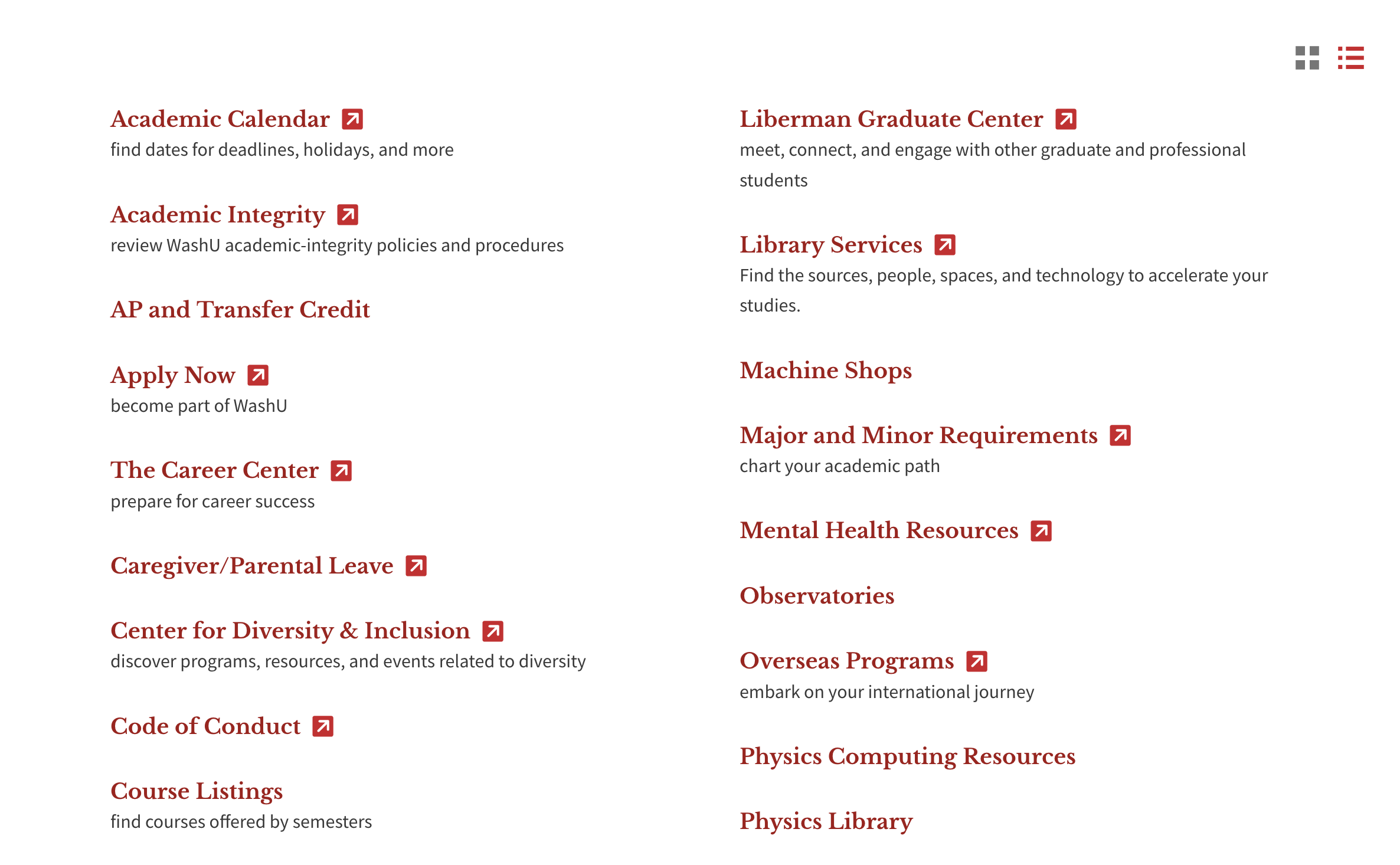
List Layout:
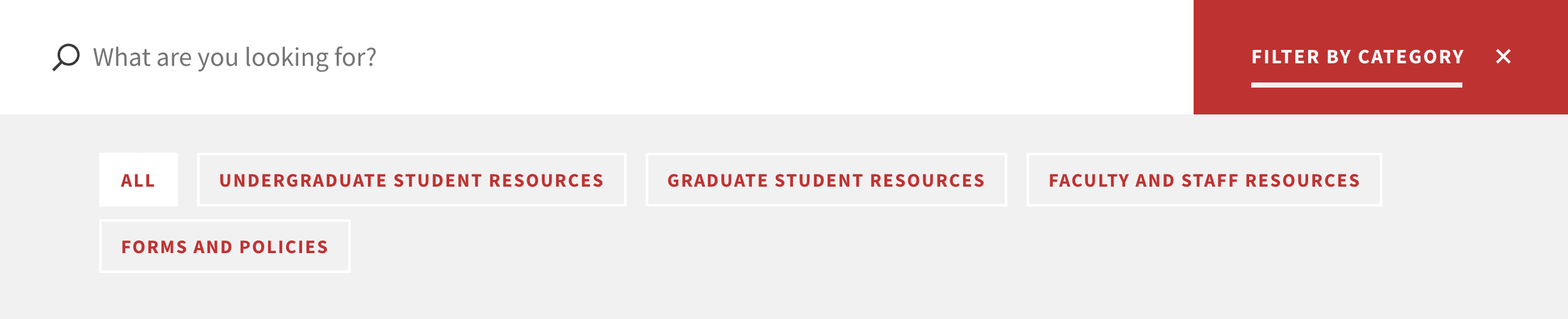
Taxonomy/Filter Terms
The taxonomy terms on your Resource Card landing page are located under the search bar and are used to sort your resource cards by category. You can tag a piece of content with multiple taxonomy terms. If you do not tag a piece of content, the content will still display on the landing page, but will not display if a user clicks on taxonomy terms since it hasn't been tagged with anything.
You have three options for displaying your taxonomy terms:
ALWAYS OPEN:
The taxonomy terms will always be visible.
COLLAPSED:
The taxonomy terms will be hidden and the user can click on the 'V' to make them visible.

HIDDEN:
There will be no taxonomy terms visible to the site visitor, only the search bar. However, they will still be available when you are editing the resource card and would like to tag it with a taxonomy term.
The 'all' taxonomy term will always display in the list of categories and cannot be removed. Any changes that need to be made to the article taxonomy/filter terms or how they display can be sent to the web team at artsci-webteam@wustl.edu
Additional display locations for Resource cards
- All published resource cards will automatically appear on the Resources landing page.
- Resources can be pulled into the resource sections in multipurpose pages and the image card landing page.
Reordering Resource Cards
By default, the list view of the cards displays in alphabetical order and the card view displays by date (most recent at the top).
Resources Queue
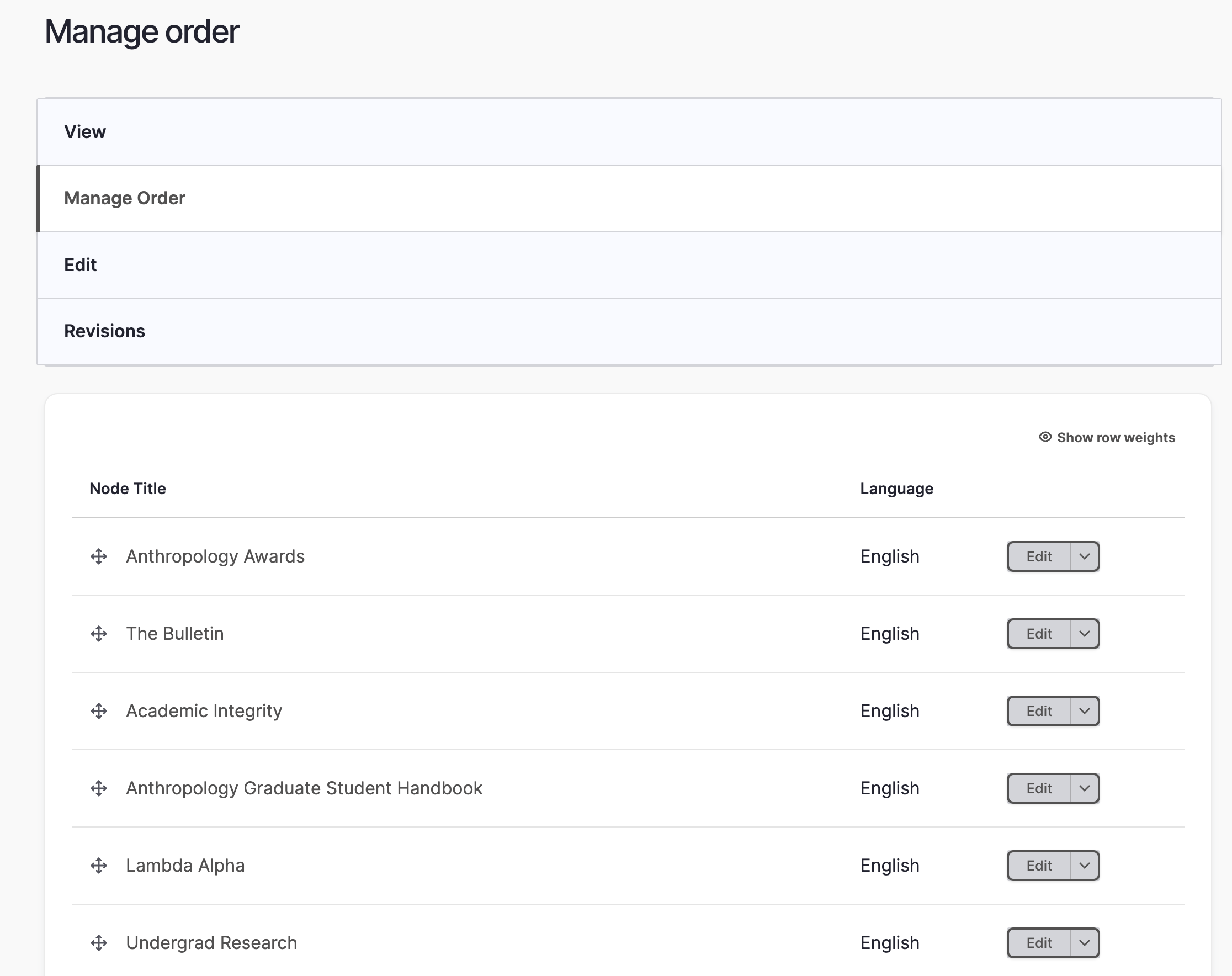
If you go to the Resources Landing page and edit, you will see an 'order resources' tab above the page title.
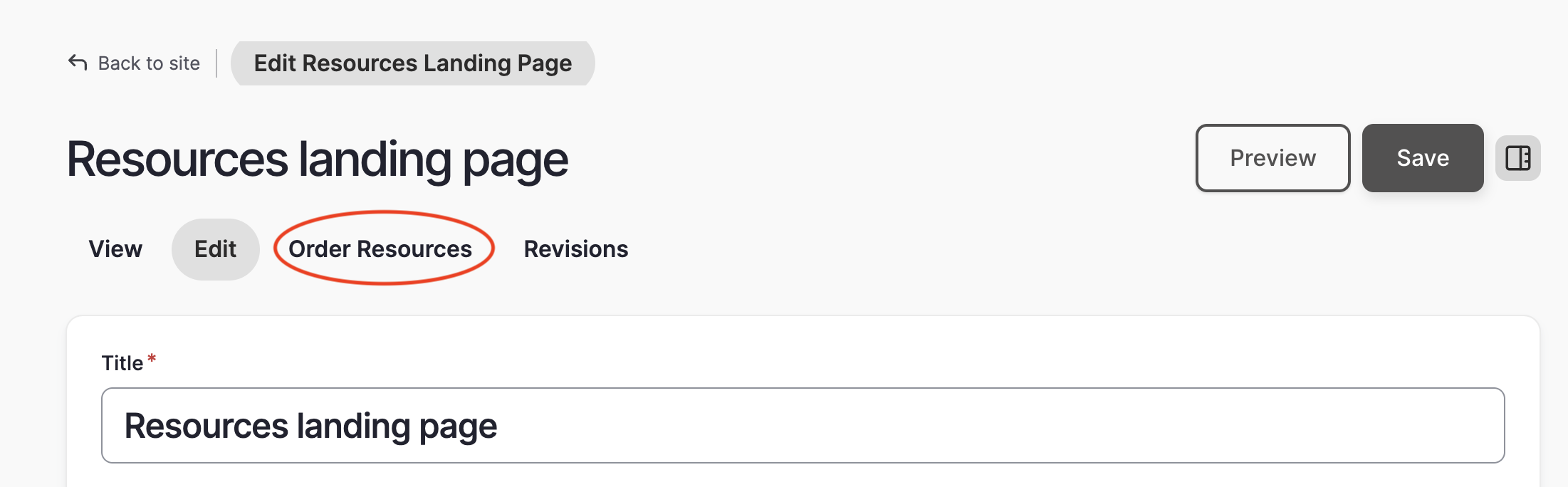
- After clicking on the 'order resources' tab, you will see a list of all of the Resource Cards in your website.
- Click on the crosshairs in front of each card title and reorder them by dragging and dropping them into the desired order.
- Once you have finished, click the 'save changes' button at the bottom of the list.
- Click on the 'view' tab to return to the main resources landing page editing screen.
Please note that reordering in the queue only applies to the grid layout of the landing page. The list layout of resources will always be in alphabetical order.
Ordering by Date
By default, resources in the grid layout are ordered by date (most recent at top) on the Resources landing page. The date does not display to visitors, so you can change it without visitors seeing it. To change the date:
- Go to find content and click "edit" next to the Resource you wish to re-order
- Scroll down to the authoring information tab at the bottom and change the date.
Please note that reordering by date only applies to the grid layout of the landing page. The list layout of resources will always be in alphabetical order.