Multipurpose Page
A multipurpose page is made up of 18 sections. Each section has a unique layout and set of features. A section will only display if content is entered into it, making the multipurpose page very flexible. Though the template is flexible in that each section is optional, the sections are not moveable. They are always displayed in the order shown.
You can also take a look at our example of a multipurpose page with every section displayed using sample content. Please keep in mind that you would never want to do this in your site. This is just for demonstration!
Introduction
The Introduction section has a static background image upload, a headline field, and a description field. If you upload a background photo, you will have a choice of a red, dark, or white image overlay. If you do not upload a photo, you can choose to have a solid red, dark, or white header background. There is also an option to display an ampersand icon in your header.

Anchor Links
In the black bar section above the main content area, you can add anchor links. An anchor link will take your site visitor straight to another section further down the page. This makes essential information quickly accessible without scrolling. If you just want to link to a section of the page, just choose that section from the Section dropdown.

The anchor link section also has the option to link to a custom section by using the 'anchor' option in a WYSIWYG. For more information and how to do this, please see the editing toolbar documentation page. If you are not using a custom link, this field should remain empty.
Main Content & Sidebar
This section is divided into a left main content area and right sidebar. The main content area has a full WYSIWYG toolbar, so you can add links, inline images, and even video. This is the first thing your site visitor is going to see, so it's important to use it wisely! It's a great place to introduce an academic area, a program, or give an overview.
The sidebar can be static or turned into a simple slideshow with icons. If you choose not to use the sidebar, the text section will go all the way across the page.

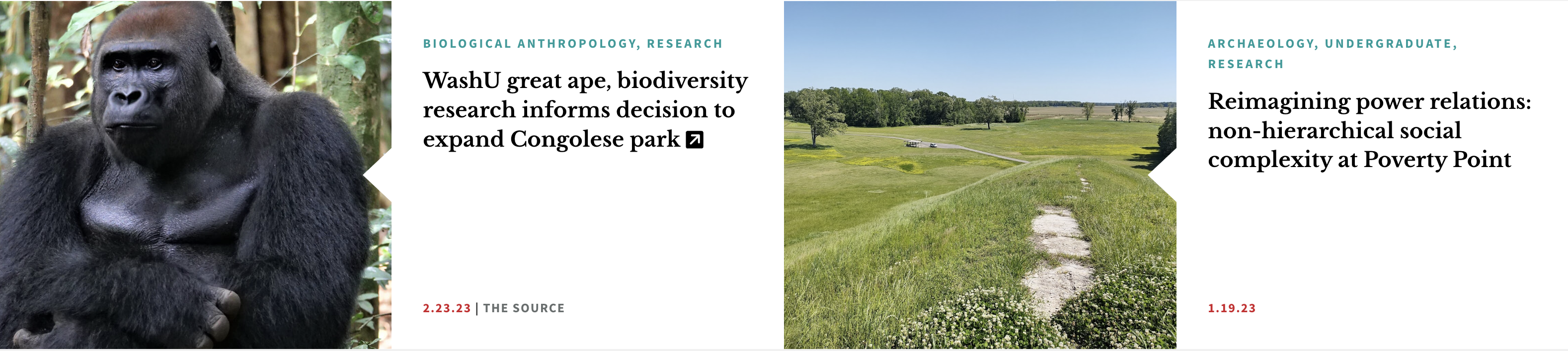
Video Spotlights and Articles
This section can have a video and two articles. The articles can be chosen from a list or a category. If you choose a category, the two most recent articles in that category will appear. You will also need a splash image for your video. In order to use the video section, your video must be hosted on YouTube. For the video URL, you should use the URL in your browser's address bar.
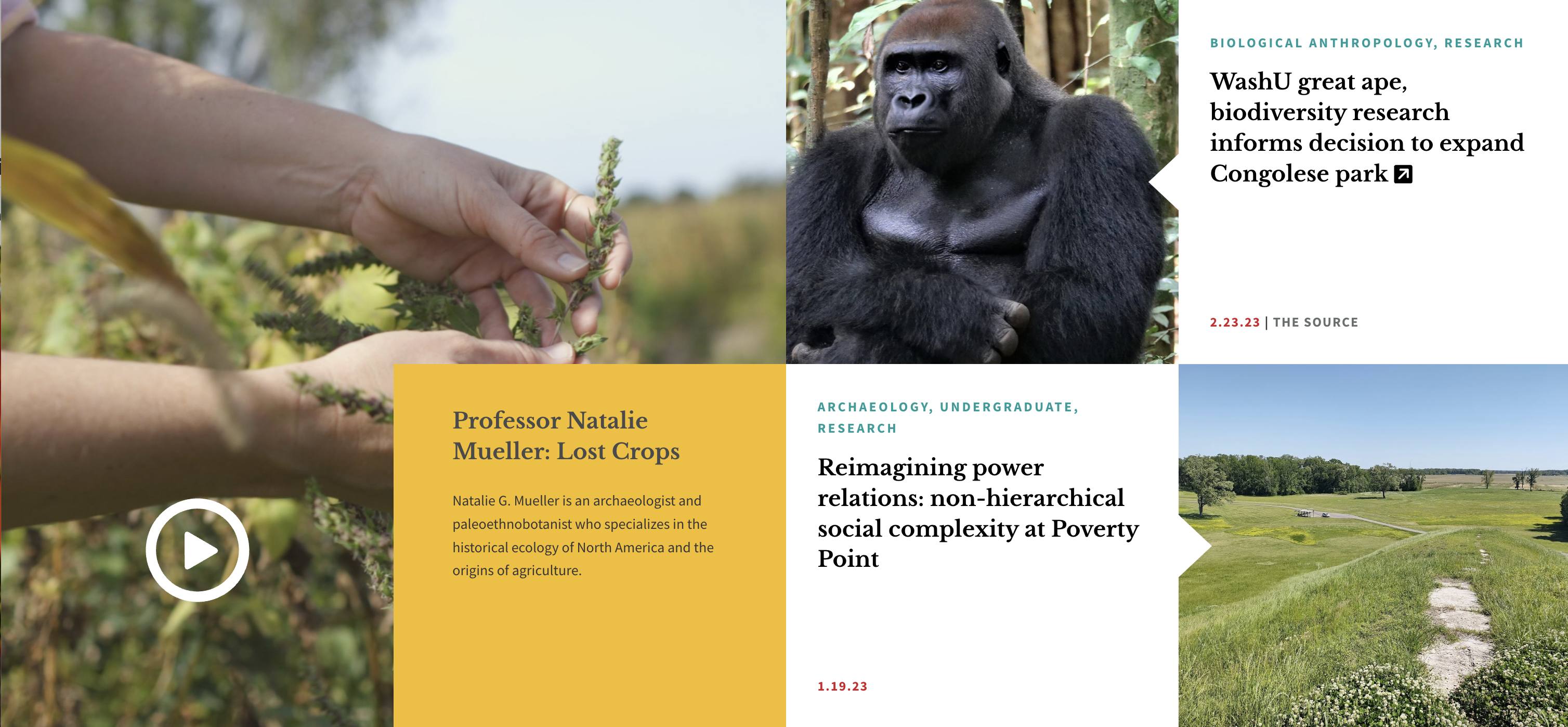
If you do not add any videos to this section, it will display your two articles side by side.
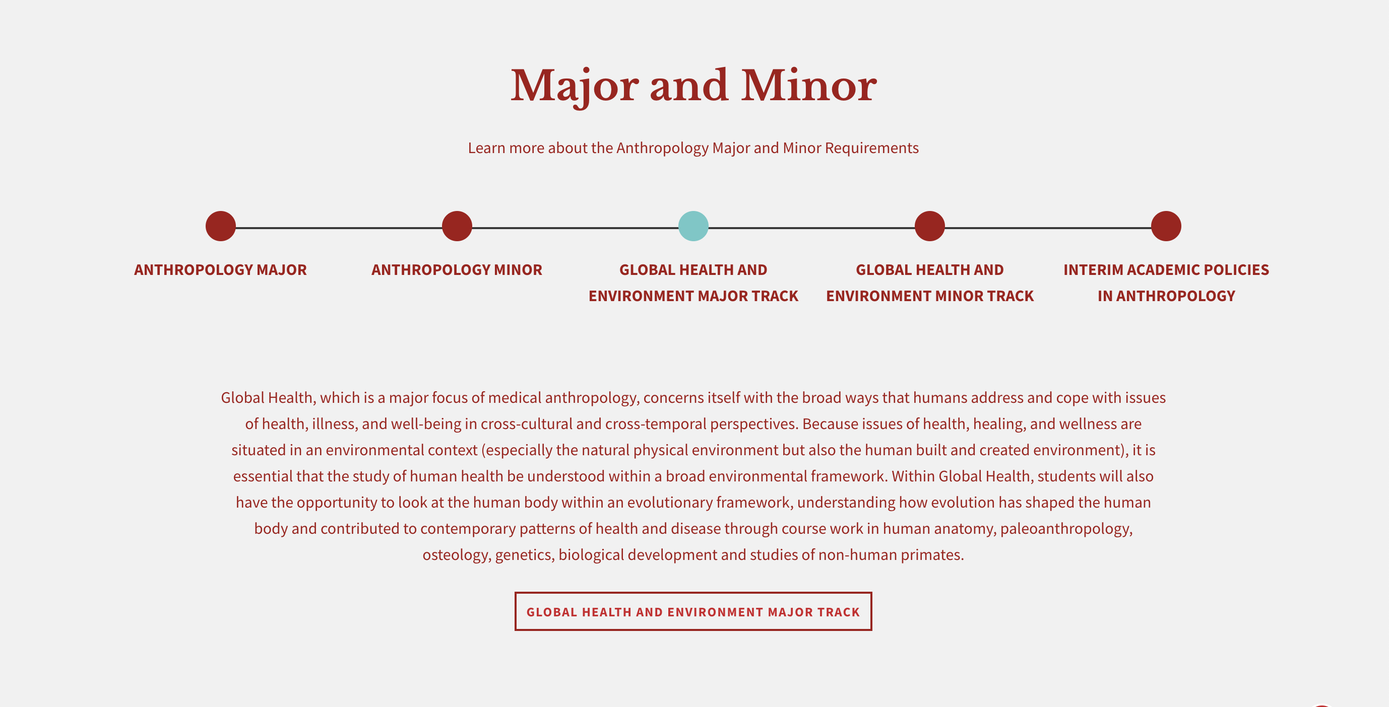
Dotted Line
This section is helpful for illustrating areas such as program subsections or department majors and minors. At the top, there are fields for a title and subtitle. You can also add up to five dots and can choose between a red, grey, or white background color. As the user clicks on the dots, they see a brief overview of your program. They can click on an optional link to get more information.
Multi and Single Image Callout
The single image callout has one image and multiple slides with text and an optional link. A multi-image callout can have multiple photos and multiple slides with text along with the optional link.

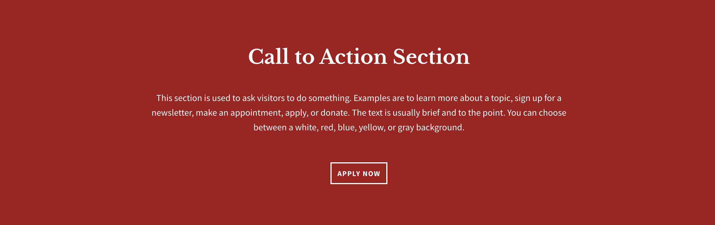
Call to Action
The call to action section has fields for a title, description, and button. You can also choose between a yellow, blue, red, grey, or white background.
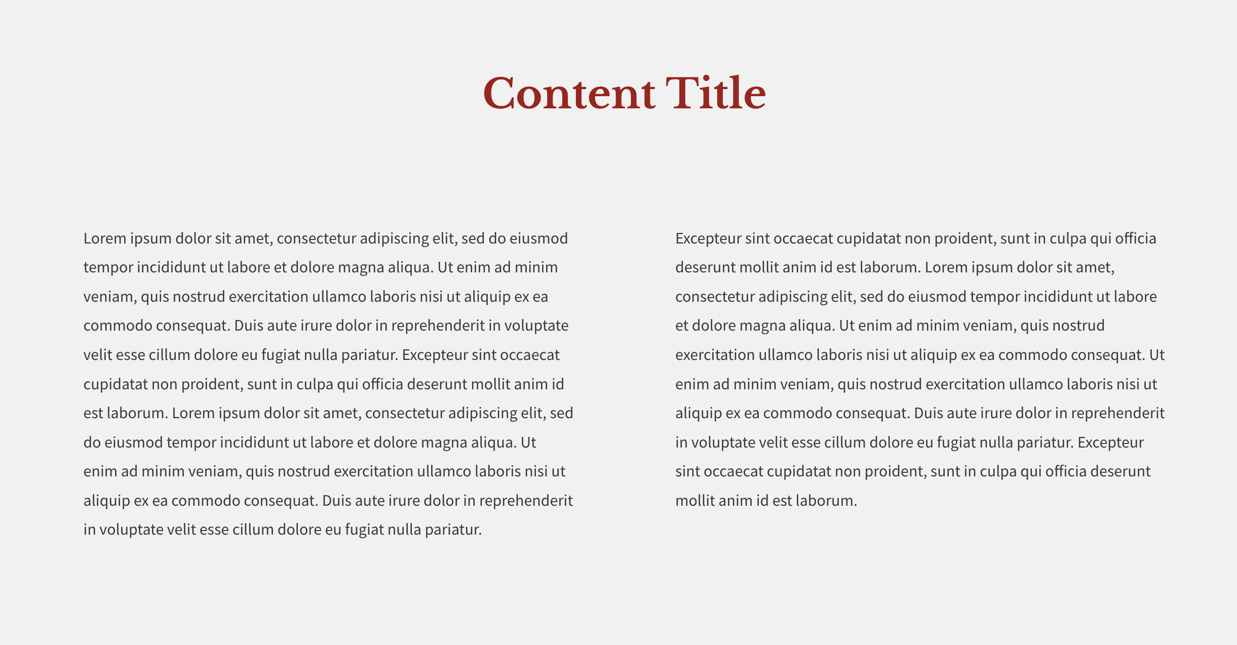
First Content Block
The content block section has a title field and a WYSIWG where you can add text, links, and images. This section also has the choice of displaying your content in a single or double column and white or grey background. This is a great option for the wordier sections of your page. Also, it is identical the the Second Content Block further down the page.
People Teaser
This section allows you to choose from the person profiles on your site and pull them into the page as a teaser. Layout options include 1, 2, or 3-columns with either white or grey backgrounds. You may either select individual people or choose a taxonomy term to pull in all people with that tag. Be careful though- if you select people manually and select a taxonomy term then nothing will display. You must choose one method or the other but not both.

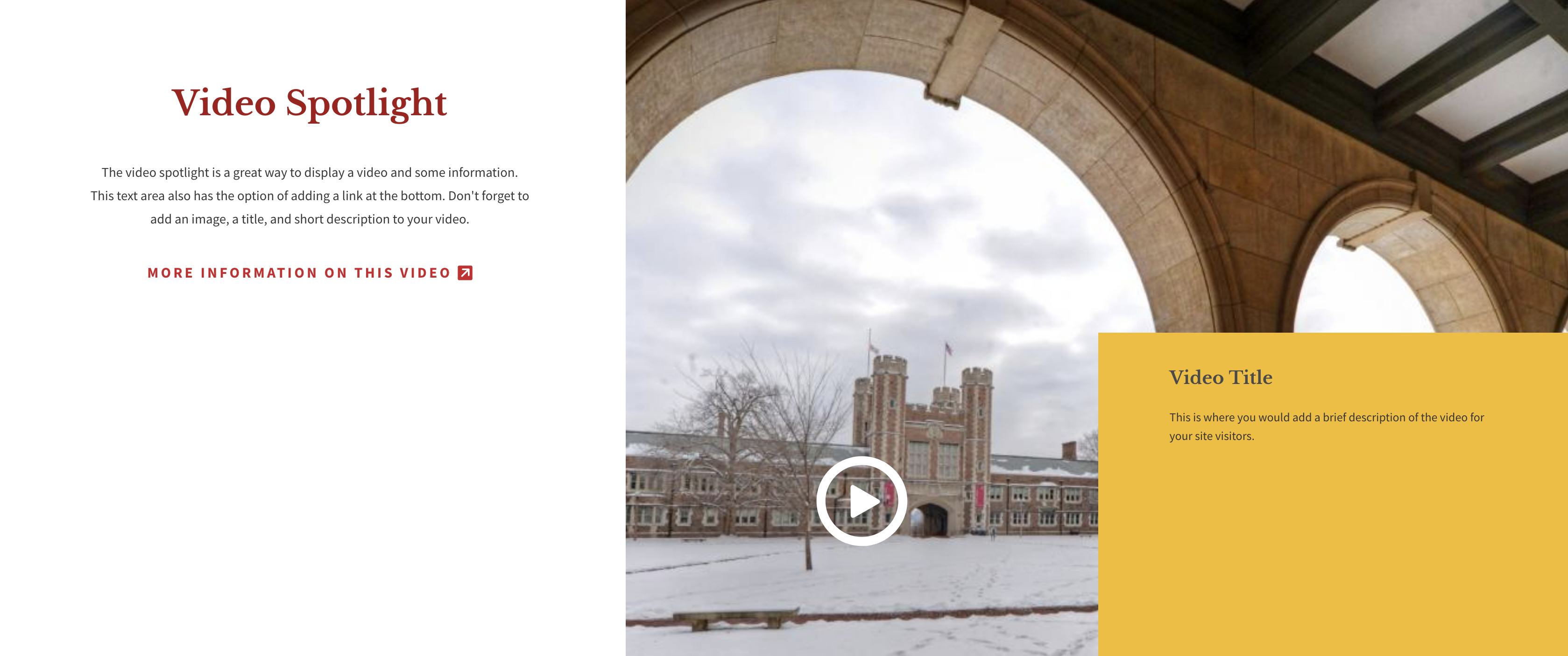
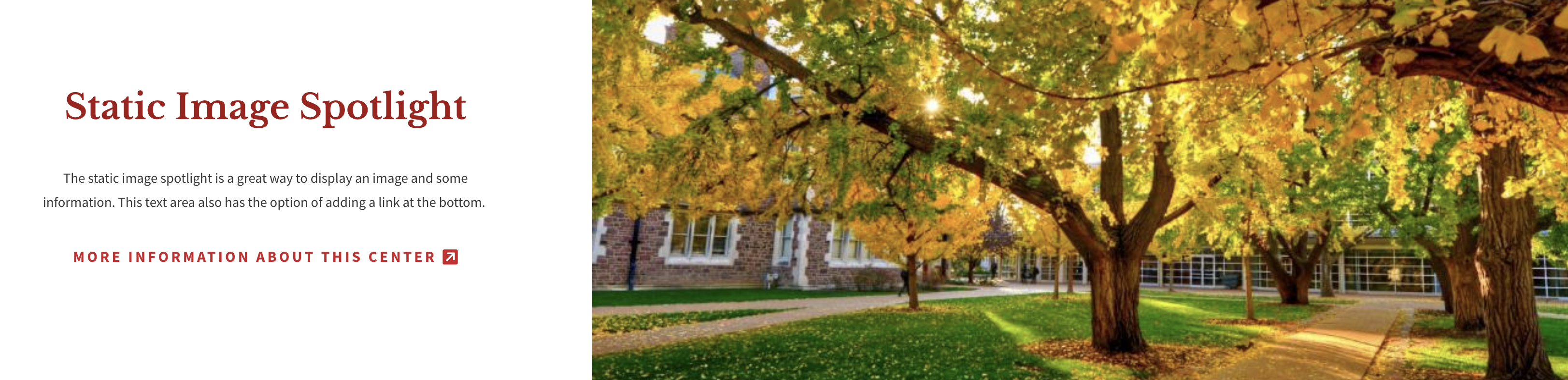
Spotlight
There are four different kinds of spotlights: Video, Static Image, Fullscreen Video, and News & Events. You may only choose one.
Video:
This section displays a YouTube video with a title and short description and an area for text and an optional link.
Static Image:
This section displays an image on one side and an area for text and an optional link.
Fullscreen Video:
This section displays a full-width YouTube video with a title and short description.

News & Events:
This section displays two articles and one event. Both the event and article sides will display the most recent content that is tagged with the chosen taxonomy term. If you choose n/a for either side, the next upcoming event and the most recent two articles will display. If you choose an event taxonomy term that is not in use on an upcoming event, the articles will display side by side.

Fullscreen Slideshow
This section has an intro text area with a WYSIWYG toolbar. You can add slides, captions, and choose a background color for the intro section.

Resources Callout
This section allows you to display selected resource cards that already exist on your site. They can be reordered by clicking on the arrows next to the cards and dragging and dropping them into the desired order. Each resource card has a title, subtitle, icon, and link to a page or document with more information. All resource cards in this area will also be displayed on the Resource Landing page. You can also add links to the red Additional Resources area below the resource cards.

Second Content Block
The content block section has a title field and a WYSIWG where you can add text, links, and images. This section also has the choice of displaying your content in a single or double column and white or grey background. This is a great option for the wordier sections of your page. Also, it is identical to the First Content Block section.
Timeline
This section displays dates and slides on a timeline. Slides have the option of having background images. We recommend choosing dark background images because the text overlay is always white.

Gallery
The gallery is a great way to showcase a small collection of images. If you are looking for a photo gallery to house more than 3-6 images, we recommend using Flickr. Each image has a WYSIWYG to add a caption, information, or even a button leading to more information.

After the user clicks on a gallery image:

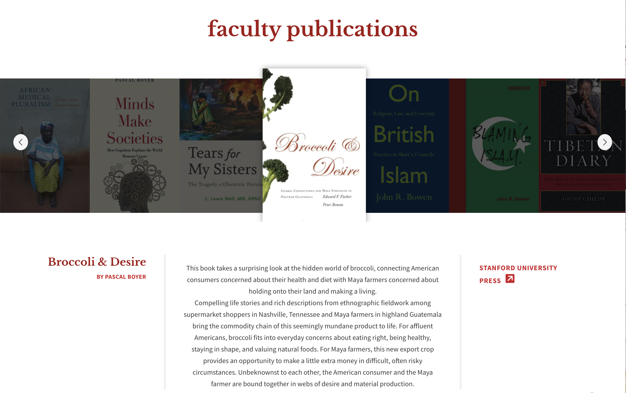
Bookshelf
A bookshelf is a section that can be toggled off or on. It requires a minimum number of books (around 6, depending on the size of the cover images) in order for it to rotate properly. You can use categories/taxonomy terms to determine which books will display on the bookshelves. If you do not use taxonomy terms, all of your site's published books will automatically display. The default bookshelf title is 'the faculty bookshelf', but you have the option to change it which is helpful for sites with multiple bookshelves. Your website can have multiple bookshelves, but only one per multipurpose page.
Any changes that need to be made to the book taxonomy terms can be sent to the web team at artsci-webteam@wustl.edu
Additional Resources
This section displays a section title and a list of individually entered resources with linked titles and subtitles. If you have more than two resources, the list will display in two columns.
Testimonials
The testimonial section lets you choose from a list of existing testimonials in your website. It is a separate content type that can be pulled into the page. If you need to add a new testimonial that isn't in the dropdown list, you will need to add it to your site first.
Footer Callout
The footer section is at the very bottom of the landing page and displays text and a button. You can also add social media links, an ampersand icon, and have a white or grey background.

Multipurpose Page Examples
Need some inspiration? Here are a few examples of multipurpose page layouts and what sections are being used in each one.
Graduate Program Landing Page Example #1
Sections Used:
- Introduction section with image
- Anchor links
- Main Content section with single icon and button in the sidebar
- Video Spotlight with Articles section without using the video fields
- Dotted Line section with links
- Single Image Callout using three slides
- Call to Action
- First Content Block using the single column option
- Spotlight section using the 'video' option
- Fullscreen Slideshow using the 'dark' header option with two slides and captions
- Resource Callout section with three resources and 'search more resources' links
- Footer Callout
Graduate Program Landing Page Example #2
Sections Used:
- Introduction section with image
- Anchor links
- Main Content section with no sidebar
- Single Image Callout using three slides
- Content Block using the two column option
- Spotlight section using the 'video' option
- Resource Callout section with three resources and 'search more resources' links
Undergraduate Program Landing Page Example #1

Sections Used:
- Introduction section with image
- Anchor links
- Main Content section with single image and button in the sidebar
- Single Image Callout using one slides
- Call to Action
- Resource Callout section with three resources and 'search more resources' links
- Gallery section
- Additional Resources links
- Testimonial
- Footer Callout
Undergraduate Program Landing Page Example #2
Sections Used:
- Introduction section with image
- Anchor links
- Main Content section with button in the sidebar
- Dotted Line section with no links
- Single Image Callout using one slide
- Content Block using the two column option
- Spotlight section using the 'static image' option
- Fullscreen Slideshow using the 'dark' header option with one slide and no caption
- Resource Callout section with three resources and 'search more resources' links
- Content Block using the two column option
- Footer Callout
Facilities and Centers Example
Sections Used:
- Introduction section with image
- Anchor links
- Main Content section with no sidebar
- Single Image Callout with one slide
- Content Block using the two column option
- Gallery section
- Additional Resources section with links
Careers and Outcomes Examples
Sections Used:
- Introduction section with image
- Anchor links
- Spotlight section using 'static image' option
- Fullscreen Slideshow using the 'dark' header option with one slide and no caption
- Content Block with two columns
- Gallery section
- Testimonial section
Diversity and Inclusion Example
Sections Used:
- Introduction section with no image
- Anchor links
- Main Content section with button in the sidebar
- Video Spotlight with Articles section without using the video fields
- Single Image Callout using seven slides
- Call to Action
- Content Block using the two column option
- Spotlight section using the 'static image' option
- Additional Resources section with links
- Testimonial section
- Footer Callout
Graduate Alumni Example
Sections Used:
- Introduction section with image
- Anchor links
- Main Content section with no sidebar
- Video Spotlight with Articles section without using the video fields
- Call to Action
- Content Block using the double column option
- Gallery section
Alumni Careers Example
Sections Used:
- Introduction section with image
- Anchor links
- Main Content section with single icon in the sidebar
- Gallery section
- Footer Callout
Study Abroad Example
Sections Used:
- Introduction section with image
- Anchor links
- Main Content section with no sidebar
- Single Image Callout using two slides
- Call to Action
- Content Block using the double column option
- Fullscreen Slideshow using the 'dark' header option with three slides and no captions
Undergraduate Research Example
Sections Used:
- Introduction section with image
- Anchor links
- Main Content section with no sidebar
- Video Spotlight with Articles section
- Single Image Callout using one slides
- Content Block using the double column option
- Resources Callout section
- Content Block using the double column option