Overall Theme Differences
There have been many changes and improvements made to the overall theme during the switch to D10. Some of these changes provide an enhanced editing experience to the department content editors, while others provide a better experience and added accessibility to site visitors
Simplified Admin Toolbar
When you log into your site, you will notice that your admin toolbar is more streamlined and has additional help features. For details about the changes, please see our admin toolbar documentation.

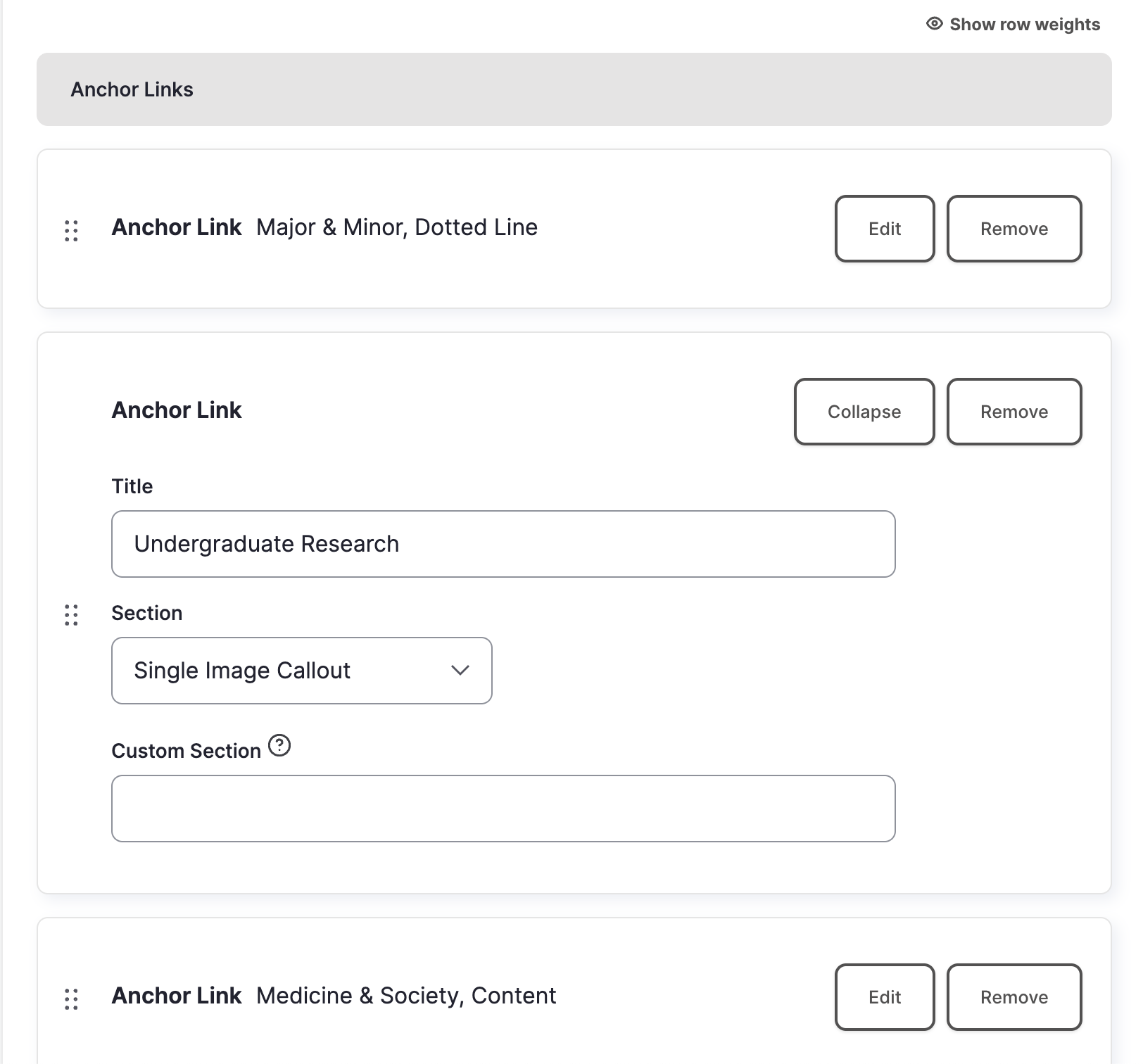
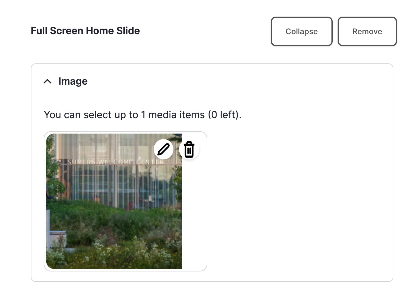
Collapsing/Expanding Sections when Editing Content
We now have the ability to collapse and expand sections while editing. This makes it easier to scroll down long pages and find the section you are looking for to make edits. This is especially useful when editing content types that have many sections, such as multipurpose, FAQs, and publication pages.
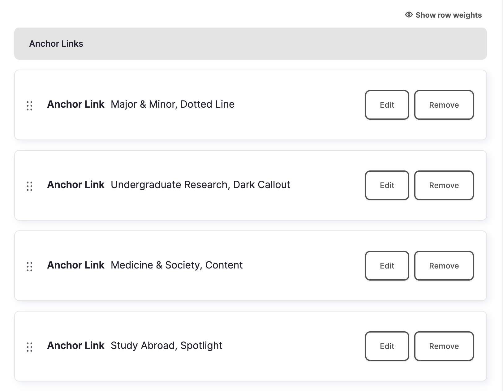
To make an edit or add content to a section, you can click the edit button which will open up the section. If you want to delete a section, click the 'remove' button.
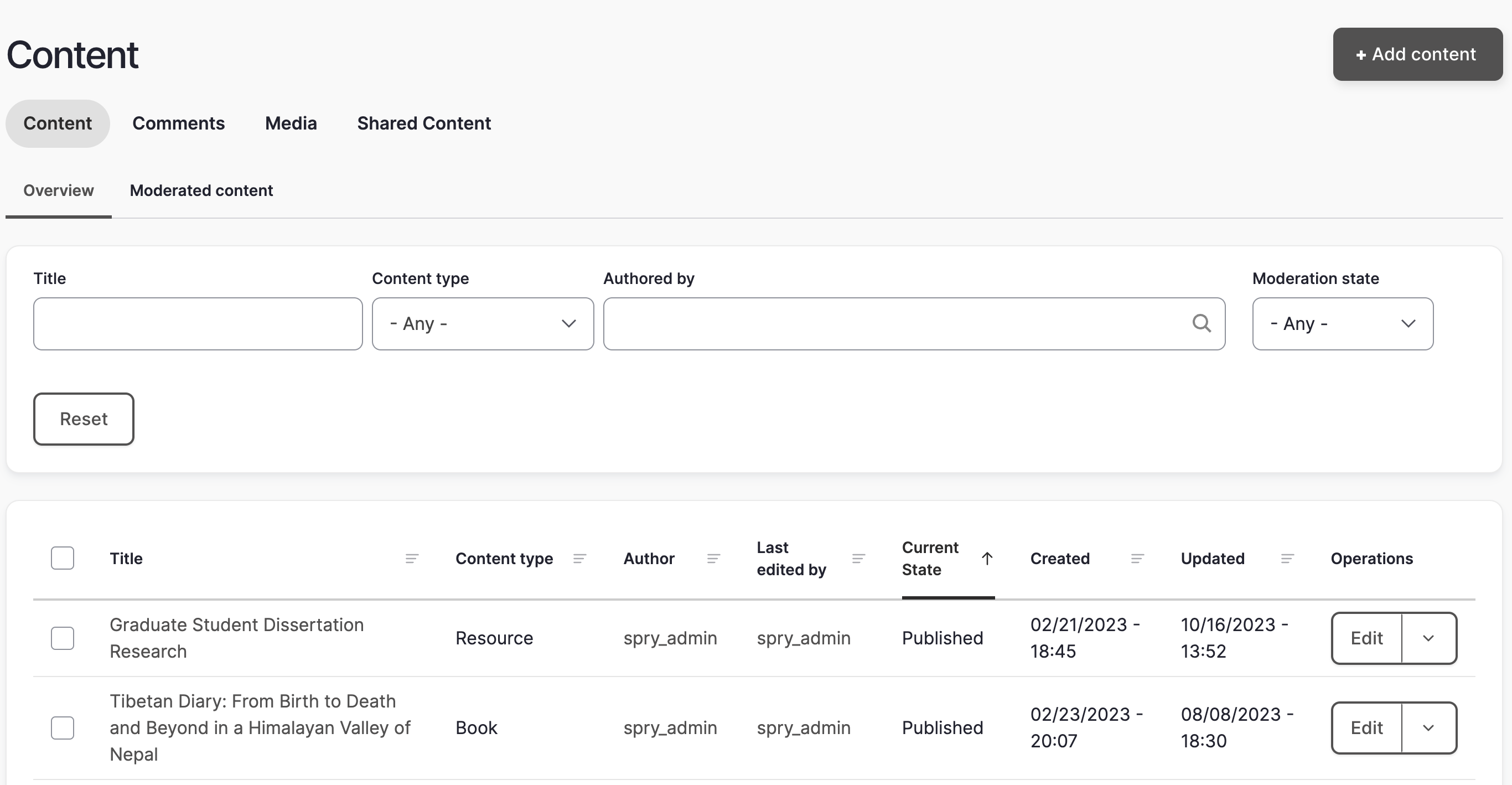
Find Content
When you click on Find Content and go to the content overview page, you will notice that the list of content now displays only published content.
To access the list of all of the content in your site that isn't published to the public (unpublished, draft, and needs review), you will need to go to the Moderated Content tab.
Content Publishing Status
There are now four options for content moderation:
Published: When content is saved as 'published', the content will be immediately visible on the live website.
Unpublished: When content is saved as 'unpublished', it will not display on the live website but can still be found on the content moderation page. The Unpublished status can be used to archive content you may want to use at a later date.
Draft: When content is saved as 'draft', it will not display on the live website. The Draft status is useful for saving work in progress.
Needs Review: When content is saved as 'needs review', someone with the Site Manager role must approve and publish it to the live site. This status is only for use by the Intern user role.
Back to Top Arrow
When you start scrolling down the page, you will notice a red arrow pop up in the bottom right corner. If you click on it, it will bring you back up to the top of the page.

Color Coded Informational and Warning Banners
There are now color-coded information banners that appear at the top of pages to alert the user while making edits.
blue = informational
- For example, a blue 'this content is currently in an unpublished state' message to remind you of the content publishing status
red = danger
- For example, a red 'one error has been found: left image' message to let you know a required image is missing from a section.
green = success
- Example: a green 'your page has successfully been saved' message when you save a page
Creating Links & Buttons
Links are still created in your WYSIWYG editing toolbar by highlighting the text you would like to link and then clicking the 'link' button. After doing this, you will get a new popup:
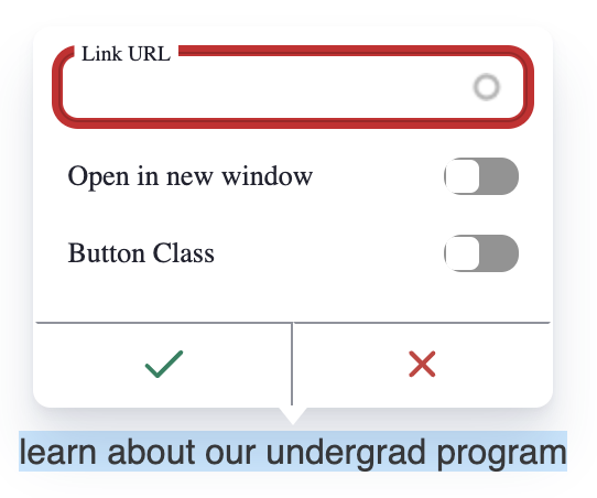
This popup will not only allow you to add a link, but also turn the link into a button and/or open the link in a new window. If you choose to open the link in a new window, an external link arrow will automatically be created for you. Only use the 'open in new window' toggle if you are linking to a file (pdf, link to file in Box, etc.), or when the link is interrupting a process, such as filling out a web form. If you are just linking to an external or non-WashU website, you should NOT check the 'open in new window' checkbox.
For more information about creating links, please visit the Creating Links section of our web guide.
User Roles
- The 'site staff' role has been renamed 'site manager'
- The 'intern' role will only be able to save content in the 'needs review' state. A Site Manager will then have to review and publish it. Undergraduate student workers will only be assigned the intern role.
For complete information about user roles and student work access, please visit our User Role Guide.
Accessibility Improvements
There have been several adjustments made to the overall theme to improve accessibility. These include:
- Alt text for images is now required
- Removal of vague link text such as 'read more' or 'read story'
- Hover-over color change for all links
- External link arrows available for all links
- Elimination of external link popup boxes
- New University accessibility guidance about links opening in new tabs or windows: Only use the 'open in new window' toggle if you are linking to a file (pdf, link to file in Box, etc.), or when the link is interrupting a process, such as filling out a web form. If you are linking to an external or non-WashU website, you should NOT check the 'open in new window' toggle.
To learn more about why these changes were made and get guidance on making accessible links, please visit our documentation on writing accessible link text.
For information about alt text, please visit our documentation on writing alt text for images.
For general web accessibility information, please visit our accessibility guide.
WYSIWYG Changes

The WYSIWYG is very similar to what was used in D7, but with a few enhancements and changes:
- Instead of having separate video and image embed buttons, they have been combined into a 'media' button.
- The left and center alignment buttons have been combined.
- There is no Styles dropdown. Adding buttons will be done while you are linking the text instead of by choosing the 'button' option in the Styles dropdown.
- There is a 'source' button that will allow you to change the WYSIWYG content area to plain text.
- There is an iFrame button to allow you to easily add iFrame embed code.
Website Help Link
If you have any questions while you are editing, clicking on the 'Arts & Sciences web help link' in the admin toolbar will take you to the Arts & Sciences web guide.
Tours
Throughout your website, you will occasionally see a question mark with the word 'tour' next to it in your admin toolbar. When you click on this link, you will get a short tour of the page you are currently on.
Adding and Editing Media Differences
Adding Video, Images, and Podcasts
When adding video and podcasts to a field in a section of your website, you can now use the actual browser URL to the video or podcast instead of using an embed code.
When adding an image to a section of your website, you will have fewer steps than in D7. To upload an image, just click 'add image' and either choose from an existing image or upload a new one from your desktop. Please note that alt text is now required on all images. For information about how to properly write alt text, please visit the Alt Text section of our web accessibility guide.
For more detailed information about using multimedia in your website, please visit our multimedia guide.
Image Focus Tool
The Image Focus Tool is now accessed by clicking on the pencil icon while you are editing a section with an image. If you click the pencil icon, you will get a popup window with a small preview version of the image, an alternative text field, and a title field. You can click and drag the + in the image in order to set its focal point.
Content Type Differences
Home Page
Change to Generic Intro with Related Links Section:
In the Generic Intro with Related Links section, adding links to the sidebar has been simplified for the person editing content. Instead of having a section for internal links and a separate one for external links, it is now a single list of links. An 'open in new window' toggle has been added to indicate an external link. The front end display has not changed.
Change to Full-Width Image w/Caption header slideshow option:
The Full-width Image w/Caption header slideshow option now has the option to turn off the image overlay. If the overlay is set to 'hide', the image will not have an overlay and a user will no longer be able to add a caption. This option restricts the user to only adding one slide instead of up to five. If the overlay is set to 'show', then the section will have an overlay on each image and the option of adding captions.
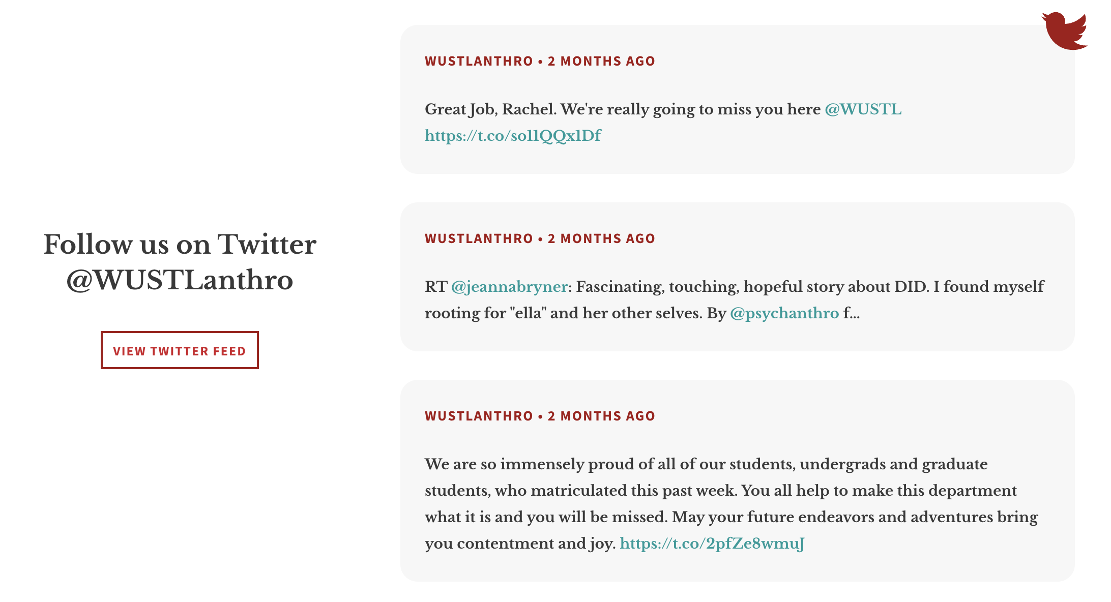
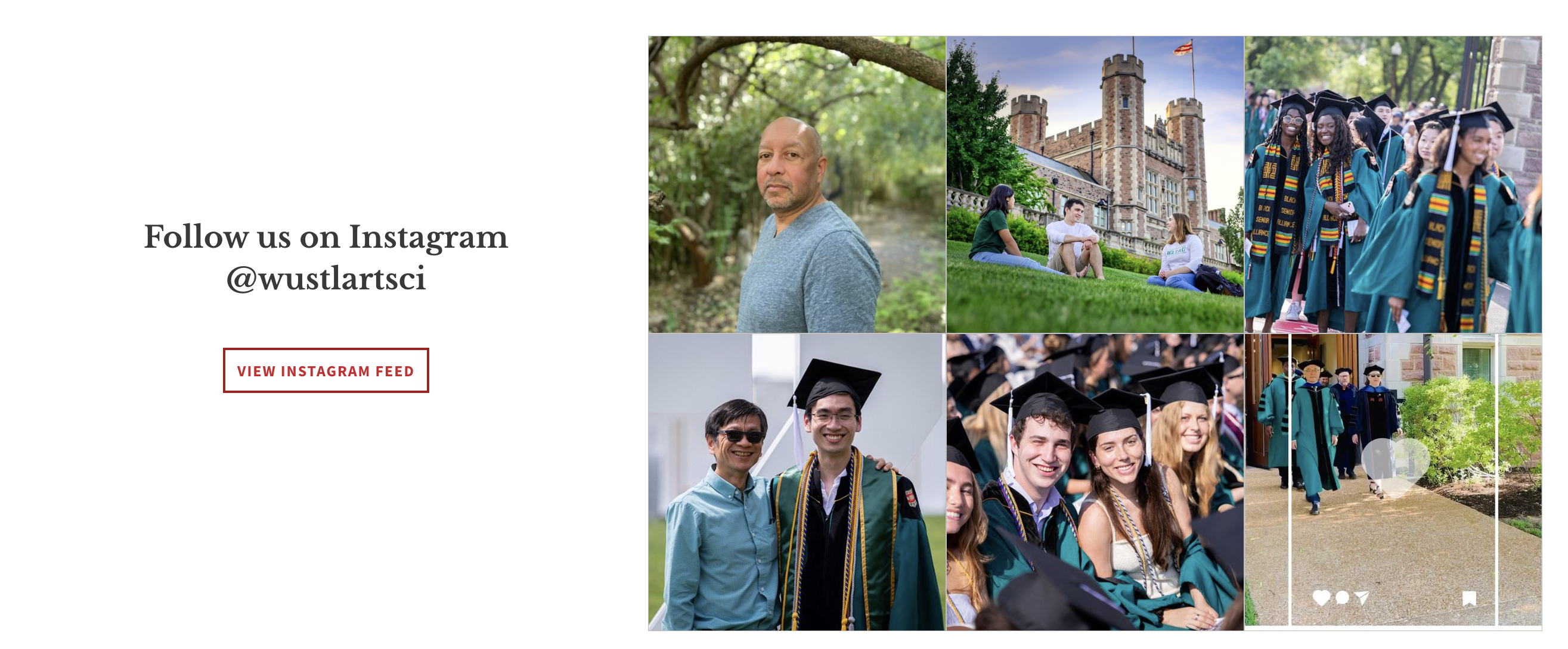
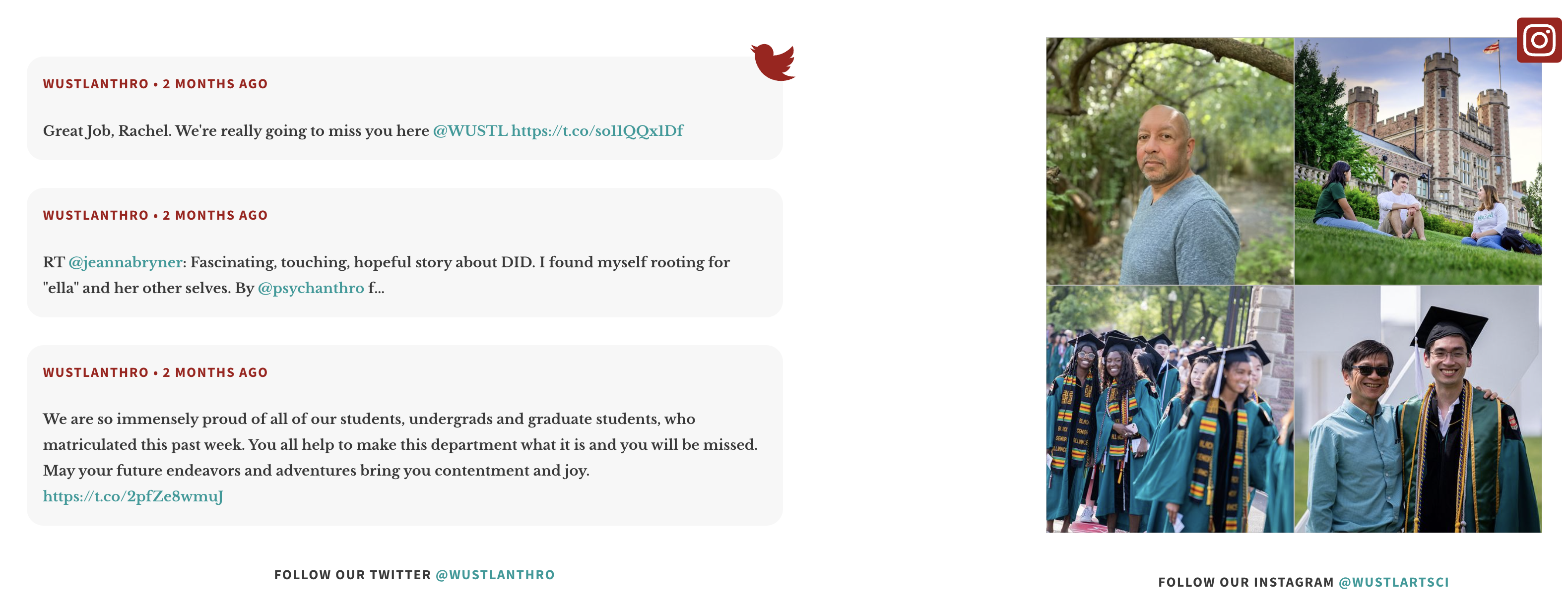
Return of the combination Twitter and Instagram section to the Home page:
This section has three different layouts. If you would like to add your Twitter and/or Instagram account to this section, you can contact the web team at artsci-webteam@wustl.edu. Once the accounts have been added, you can change the layout by editing the section in your home page.
Twitter only:
Instagram only:
Twitter and Instagram:
No more external event or article popup windows:
Instead of having a popup window to let the user know they are being taken to an external website, there will be an 'external link' arrow after the Event or Article title.
Publication name on external articles pulled into Home page sections:
There is now an optional field available if you are adding an externally linking article. This field allows you to display the name of the publication being linked to
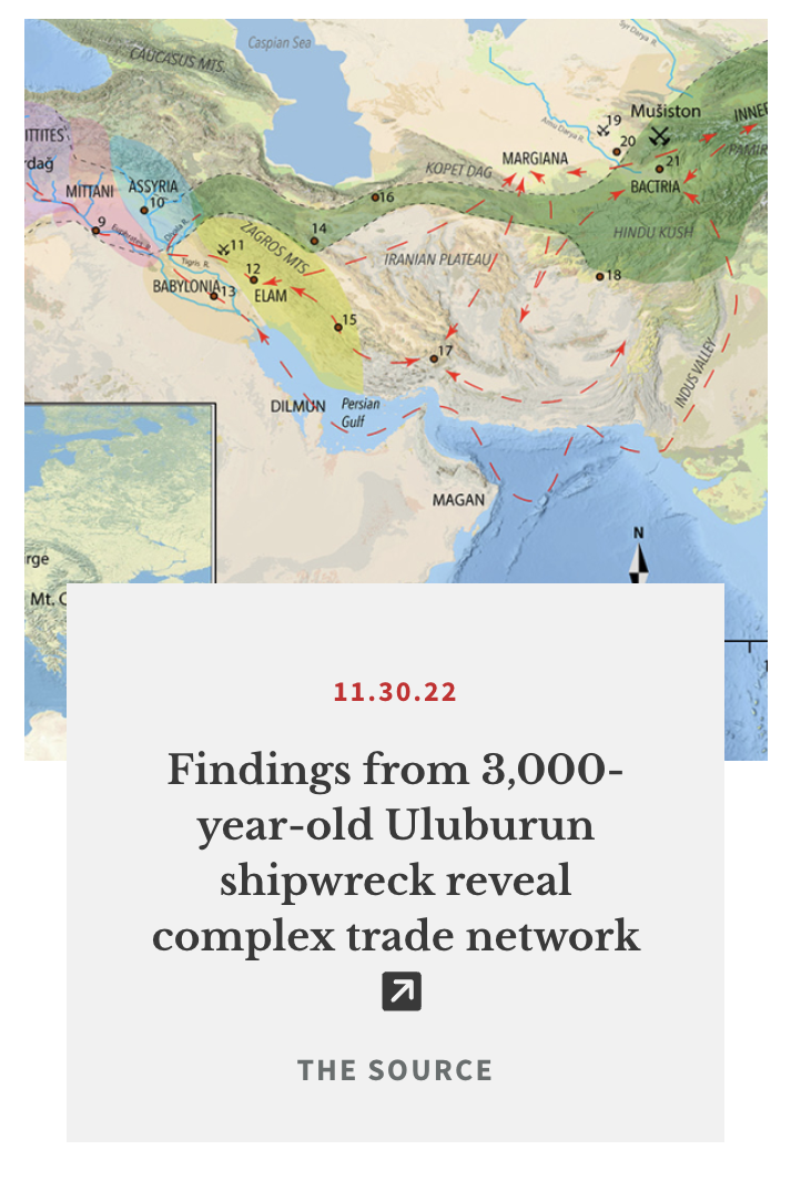
'Read more' text on events and articles has been removed:
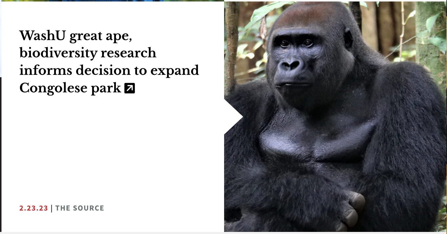
Instead of clicking 'read more' text on an event or article to view the details, the user will click on the title. This change is for both regular events/articles getting pulled into the Home page and events/articles being featured in the home page header slideshow.
News Landing Page
Publication name displays on external link articles:
There is now an optional field available if you are adding an externally linking article. This field allows you to display the name of the publication being linked to.
'All' taxonomy term in list of Categories:
The 'all' taxonomy term will always display in the list of categories and cannot be removed. The 'all' option gives the user an easy way to change from a filtered view back to a view showing the full list of articles.
No more external article popup windows:
Instead of having a popup window to let the user know they are being taken to an external website, there will be an 'external link' arrow after the article title.
Upcoming & Past Event Landing Pages
Users can upload header images:
Site managers now have access to upload header images to both the Event and Past Event Landing Pages.
'Read more' text on events has been removed:
Instead of clicking 'read more' text on an event on the landing page to view the details, the user will click on the title of the event. This change is for both regular events and events in the featured event header slideshow.
No more external event popup windows:
Instead of having a popup window to let the user know they are being taken to an external website, there will be an 'external link' arrow after the Event title.
'All' taxonomy term in list of Categories:
The 'all' taxonomy term will always display in the list of categories and cannot be removed. The 'all' option gives the user an easy way to change from a filtered view back to a view showing the full list of events.
Events
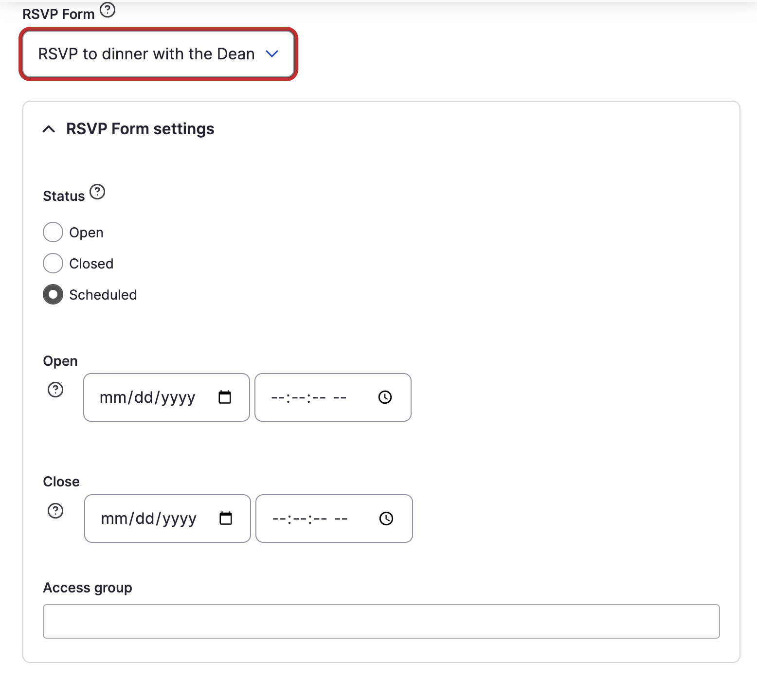
RSVP webform status can be edited in the Event:
RSVP forms pulled into an Event can now be set to open, closed, or can scheduled to open and close on scheduled dates in the individual event.
If you click the question mark next to the Form dropdown in the Embedded Webform section, you now have a direct link to edit the chosen webform.
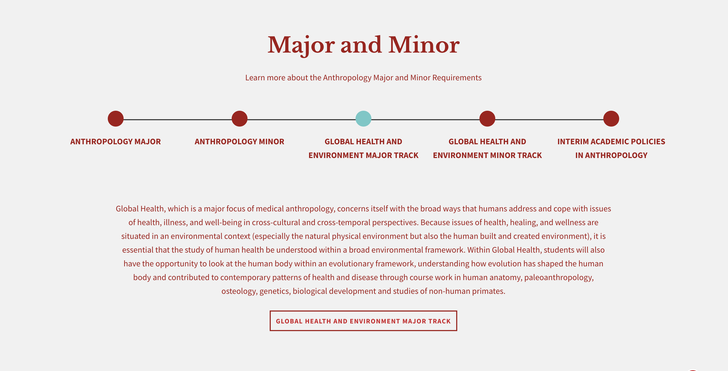
Multipurpose Page
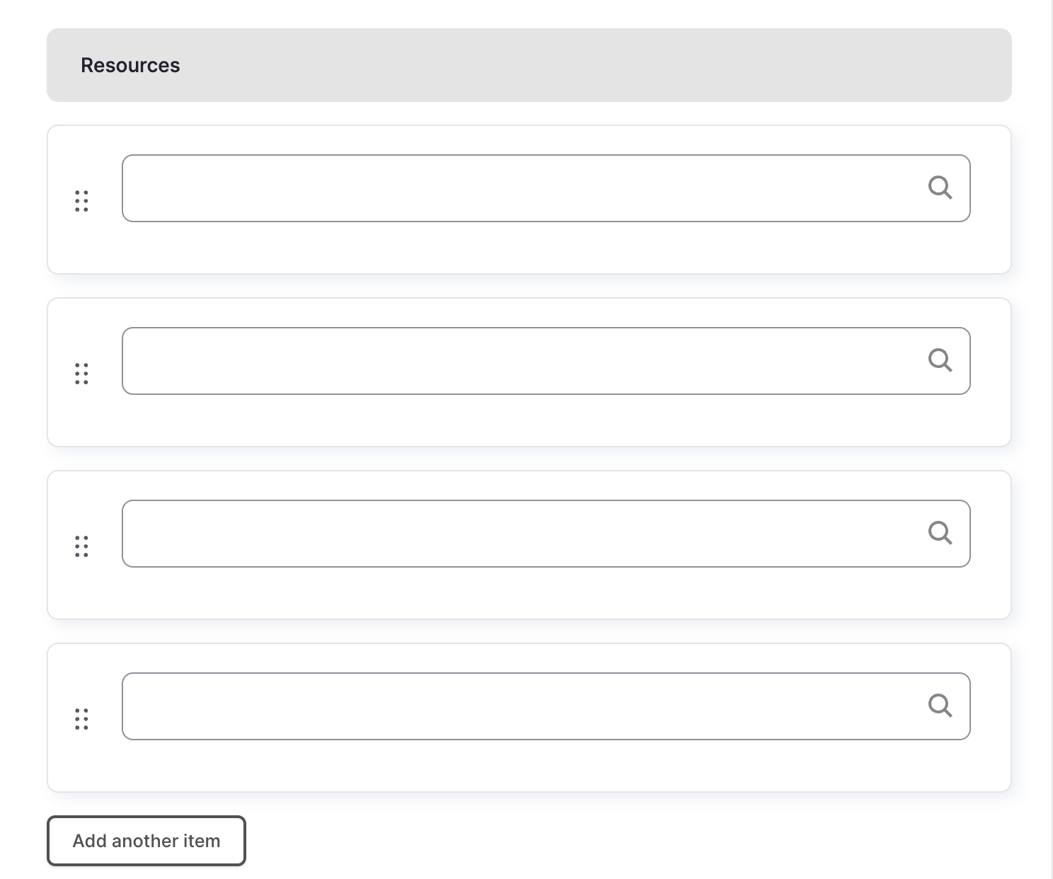
Resource cards in the Resources Callout can now be reordered:
The Resources Callout resource cards can now be reordered. To add a resource card, start to type the card title into the auto-populating field. Once the cards have been added, they can be reordered by clicking on the arrows next to the individual cards and dragging and dropping them into the desired order.
Bookshelf Size and Functionality Changes:
The bookshelf is now slightly smaller overall. You are also able to add fewer books (around 6, depending on the size of the cover images) for the shelf to properly rotate. If you do not have enough books for it to rotate, the user can now still click on the inactive books and have their information displayed.
Link text is now a button on dotted line section:
On the dotted line section, in order to make sure it is clear to users that the slides link to more information the link text below the slide description is now a button.
Removal of Embedded Webform Section
The Multipurpose page will no longer have an embedded webform section.
Image Card Landing Page
Resource cards in the Resources Callout can now be reordered:
The Resources Callout resource cards can now be reordered. To add a resource card, start to type the card title into the autopopulating field. Once the cards have been added, they can be reordered by clicking on the arrows next to the individual cards and dragging and dropping them into the desired order.
Link text is now a button on dotted line section:
On the dotted line section, in order to make sure it is clear to users that the slides link to more information, the link text below the slide description is now a button.
'All' taxonomy term in list of Categories:
The 'all' taxonomy term will always display in the list of categories and cannot be removed. The 'all' option gives the user an easy way to change from a filtered view back to a view showing the full list of image cards.
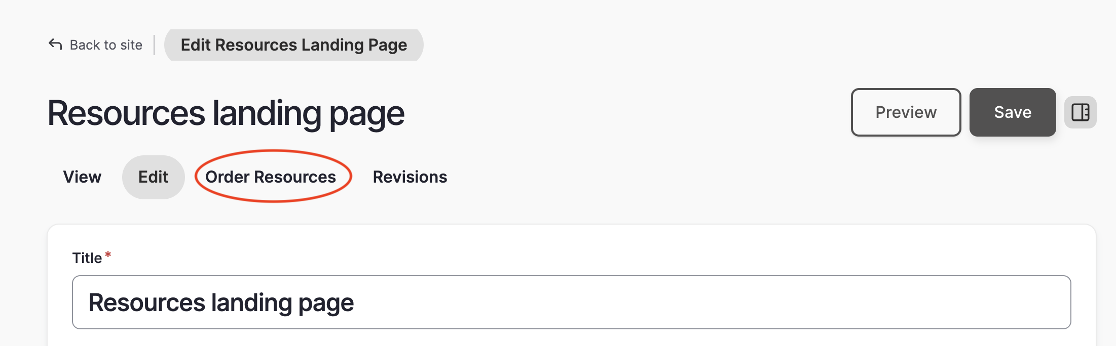
Resources Landing Page
New way to reorder Resource cards:
The resource queue has gotten a D10 makeover and is easier to use! When you are editing your Resources Landing page, you will see an 'order resources' tab where you can drag and drop your resource cards in the desired order.
'All' taxonomy term in list of Categories:
The 'all' taxonomy term will always display in the list of categories and cannot be removed. The 'all' option gives the user an easy way to change from a filtered view back to a view showing the full list of resource cards.
People
Page title field has been removed:
The title is now automatically created from the first and last name fields.
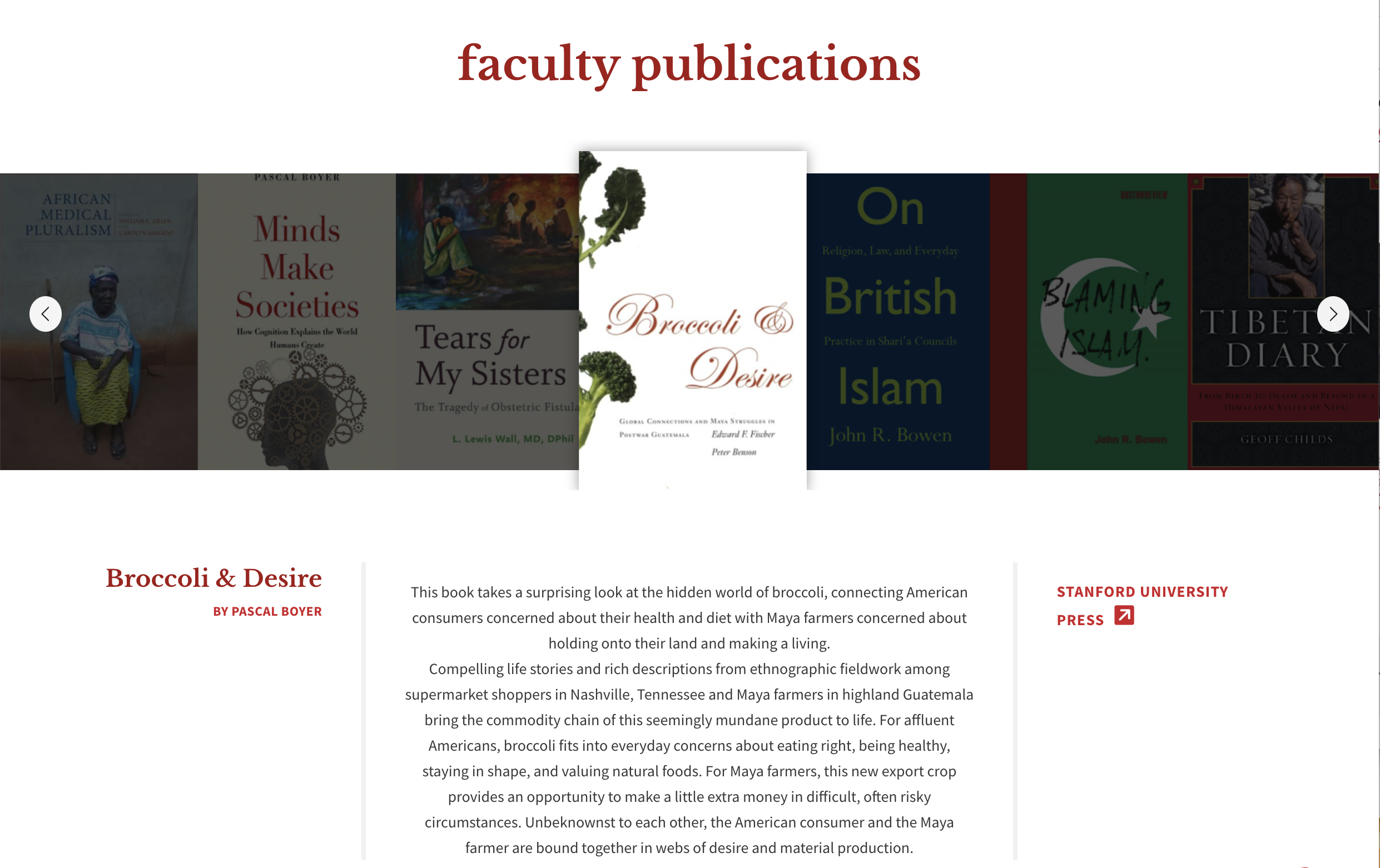
Publication Page
'Read more' text has been removed:
Instead of clicking 'read more' text in sections to view the details, the user will click on the title of the article or name.
No more external article popup windows:
Instead of having a popup window to let the user know they are being taken to an external website, there will be an 'external link' arrow after the article title.
Webforms
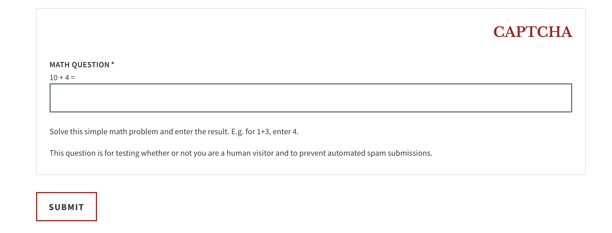
Automatic Captchas:
In D9, you no longer have to add a captcha to each form. They will automatically be added to every webform for you.
There is a brand new Drupal 9 system for webforms! To learn about how to build a webform and what features are available, please see the full details in the webform section of our web guide.